Ҫ��(sh��)�F(xi��n)���ӱ����ɫ�ĝu׃Ч������Ҋ(ji��n)��һ�������N�� ��(xi��n)�ԝu׃��linear gradient�����؏�(f��)��(xi��n)�ԝu׃��repeating-linear-gradient��������u׃��radial-gradient�������������N��(ch��ng)��ʾ����
һ����(xi��n)�ԝu׃
��(xi��n)�ԝu׃����ʹ����ɫ��ָ���ķ����Ϗ�һ��(g��)�ɫ�^(gu��)�ɵ���һ��(g��)�ɫ������ʹ��linear gradient���Ԍ�(sh��)�F(xi��n)
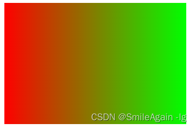
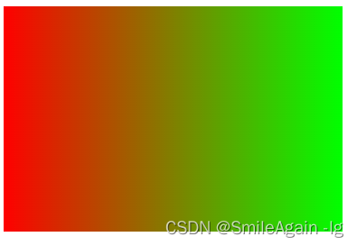
1���������ҝu׃��
.gradient-box { width: 300px; height: 200px; background: linear-gradient(to right, #ff0000, #00ff00); }
to right ָ���˝u׃�ķ��������M(j��n)�Нu׃��#ff0000 ����ʼ�ɫ���tɫ����#00ff00 �ǽY(ji��)���ɫ���Gɫ����
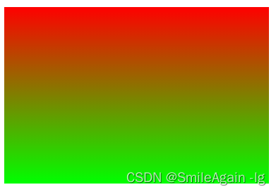
2����ֱ�u׃��
.gradient-box { width: 300px; height: 200px; background: linear-gradient(to bottom, #ff0000, #00ff00); }
3����(du��)�ǝu׃
.gradient-box { width: 300px; height: 200px; background: linear-gradient(to bottom right, #ff0000, #00ff00); }

.gradient-box { width: 300px; height: 200px; background: linear-gradient(to bottom right, #ff0000, #00ff00); }
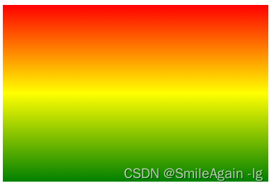
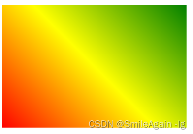
4���Զ��x��(xi��n)�ԝu׃���g�^(gu��)��ɫ
.gradient-box { width: 300px; height: 200px; background: linear-gradient(red,yellow,green); }
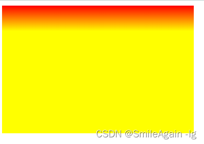
5���Զ��x�ٷֱȾ�(xi��n)�ԝu׃��
.gradient-box { width: 300px; height: 200px; background: linear-gradient(red 0%,red 50%,yellow 50%,yellow 100%); }
���a���Ժ�(ji��n)��(xi��)��
.gradient-box { width: 300px; height: 200px; background: linear-gradient(red 50%,yellow 50%); }

.gradient-box { width: 300px; height: 200px; background: linear-gradient(red 0%,yellow 20%,yellow 100%); }
6���ǶȾ�(xi��n)�ԝu׃
.gradient-box { width: 300px; height: 200px; background: linear-gradient(45deg,red,yellow,green); }
�Ƕȿ����Լ��{(di��o)��
�����؏�(f��)��(xi��n)�ԝu׃
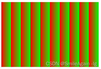
�؏�(f��)�ɫ�u׃��һ�Nʹ�����ɫ���ض��������؏�(f��)�u׃��Ч��������ʹ�� repeating-linear-gradient ���ԁ�(l��i)��(sh��)�F(xi��n)��
.gradient-box { width: 300px; height: 200px; background: repeating-linear-gradient(to right, #ff0000, #00ff00); }
.gradient-box { width: 300px; height: 200px; background: repeating-linear-gradient(to right, #ff0000 10%, #00ff00 20%); }
���������ɫ�u׃��
�����ɫ�u׃��һ�Nʹ�����ɫ��һ��(g��)�����c(di��n)����ݗ��u׃��Ч��������ʹ�� radial-gradient ���ԁ�(l��i)��(sh��)�F(xi��n)��
�A�Ώ���u׃��
.gradient-box { width: 300px; height: 200px; background: radial-gradient(circle, #ff0000, #00ff00); }
[1] [2] ��һ�(y��)
| 